I was just browsing the MyMart blog and spotted that Ralph Lauren has set up its own m-commerce site and is allowing customers to buy from it from a small selection of their ranges. You can reach the mobile site via QR code, texting in to a shortcode or going directly to the URL http://m.ralphlauren.com.
There is a common misunderstanding by high end fashion companies that their customers somehow aren't digitally minded and wouldn't dream of using the internet. I've no idea where they get that from but it certainly isn't true - Net-A-Porter and Vertu are testament to that. So I'm very pleased to see that Ralph Lauren is getting in on the mobile act.
I think the QR code thing is a bit of a red herring at the moment. The readers aren't embedded on most phones and it's a bit of a hassle to get the reader, download it, remember where it is, open the reader application, open the shutter and then take the picture of the barcode when it would be easier to text in to a shortcode or go directly to the URL. [Of course, it's a different thing once we have the software pre-installed and deeply embedded so our phones *know* when it can see a QR code and automatically give us the option to use it or not.] I digress.
I'm not a Ralph Lauren shopper (well save for a lovely pair of RL shades I got at TK Maxx and a liking for the RL fragrance Romance) so am probably not the target audience. The thought of wearing crisp white pants and a blue, red and white polo shirt fills me with dread. But I know others feel differently about these things otherwise RL wouldn't be doing nearly so well.
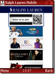 Anyway, I thought I'd take a closer look at the site to see what I liked (or not) about it.
First off we have the opening page. And it's just a list of banners rather than words or words and banners. And they're very difficult to read as the writing on them is tiny. If you're not familiar with RL, these may be a bit confusing anyway. There are written links further down but they don't relate to the banners and don't shed much more light.
Rather confusingly, the first 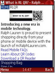 option is for the QR code information. Now it seems to me that if you have found your way to the RL mobile website already, the chances are you don't need to use a QR code to get to it. As you can see below, the introduction doesn't help much either as you have to do more clicking to get to the information.
Leaving that to one side, I have a glance around at some of the other pages.
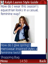 It's not particularly inspiring and I'm not convinced huge amounts of time was spent putting the offering together.
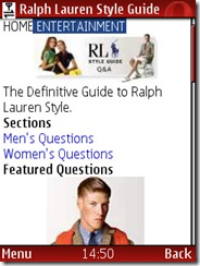
The Definitive Guide to Ralph Lauren Style is useful and is good 'snacking' information.
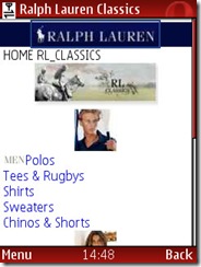
The sales info is not terribly exciting - they're assuming the customer knows all about the brand and collections already, and quite frankly, I have no idea about the different collections so it would be useful to have a few words (and I mean just a few) to explain the difference between RL_Classics and The Ralph Lauren Collection as an example.
Now maybe most of the customers who find the RL mobile site are existing RL customers and know what they're after and what they're looking for without having to browse around. In which case, the site needs a search facility. The scenario is that you're looking at Vogue, Tatler or some other fashion magazine and see the Ralph Lauren advertisement with the bag you absolutely must have *now* and you're short on time. A search facility to enable that sale would be invaluable. And when you consider the price for each item in stock, a handful of sales are very important (dresses at $2,000, sandals at $700 and an imported bag at almost $20,000 and the basic polos at $75 it soon mounts up).
On the actual shopping page for the polo shirts, you were given the option as to what colour you might want and asked you your size, but there was no link to a size guide. And for the really expensive items, wouldn't you want a bit of personal service and be connected by telephone to your local sales advisor?
So, 10/10 for bothering to do something on mobile but 5/10 for implementation. More thought needs to go into who the customer is, when they might use a service like this and what service that should actually be.
Hi Helen,
ReplyDeleteI agree that the mobile site to which you get after scanning the codes of Ralph Lauren might not be the best to use. However they want to sell you something, make money out of the 'click' and simply generate media buzz plus brand marketing. As this is the first initiative of this kind in the world outside Japan/Asia I would say the site is quiet OK. We will see more and more ads and banners on mobile pages while the mobile-ad world gets more experienced and ad-networks (plus normal publishers) learn how to deliver content for mobile devices more efficiently.
To the 'problem' with the QR-reader on the handset, I think in the near future a lot more handsets will have a default reader installed and campaigns like this one help a lot to raise awareness in this sector. However, our site Snappr.net allows you to take a photo of a 2D Code and send it via MMS/E-Mailto Snappr@Snappr.net. The service will try to decode the image and send you the content back. That works without a reader application; all you need is a camera and a message to Snappr.net. It only takes a little longer than decoding it with an app on the device but if a user ‘just wants to try’ this is a very good start.
It is just the beginning of mobile marketing and mobile interaction with 2D Codes and personally I am excited that RL implemented their system. Even Time magazine had a full page on the campaign. Let the world be mobile!
Cheerio,
Philip
Download the NeoReader to your iPhone and start interacting with Ralph Lauren QR codes.
ReplyDelete:)
@peter Thanks for leaving a comment.
ReplyDeleteI'm not actually sure this is a *first* per se but I take your point.
I don't however see a future for QR codes until such point as the software is not just pre-installed (I have it on my N95 but never use it - well, I can never find it when I need it) but deeply integrated to the camera so you don't have to think about it. You just take a picture and your phone does the rest. Snappr sounds like a good interim product, but still sounds a bit gimmicky (at least at this stage in the market).
I'd love to see QR codes implemented properly but without that deep integration I describe, it isn't going to happen.
And all the QR codes in the world won't make up for a poor destination once you've interacted. And unfortunately Ralph Lauren's mobile website leaves a bit to be desired.
@streetstylz
I don't have an i-phone.
Why bother downloading the QR code reader? There is no added value for me to do that. It's time-consuming, no guarantee of working and isn't integrated with the camera (unlike say the Shozu application) so a very clunky user experience...
1. see advert.
2. text in to get link to download reader
3. download reader.
4. find app on phone
5. open camera shutter
6. take picture of qr code
7. get to site.
Wouldn't it be easier just to go to the site straight away?
I totally agree there were some initial poor 'UI' decisions being made on the Ralph Lauren campaign.
ReplyDeleteBTW have you seen how they implemented storefront QR codes for their New York Rugby brand store http://deancollinsblog.blogspot.com/2008/08/ralph-lauren-physical-storefront-qr.html
Having said this QR codes are a huge boon to PWC. Check out www.Cognation.net/QR for some ideas on how else to implement QR codes.
Regards,
Dean Collins
www.Cognation.net